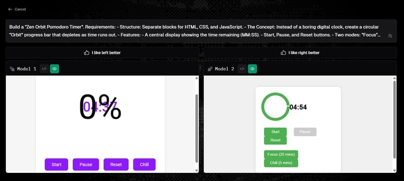
At first glance, this looks like a design problem. Make it circular. Make it smooth. Add some pastel colors and a calming font.
Maybe animate an SVG stroke so it “feels” like time is passing. That’s where most implementations land. And that’s exactly why most Pomodoro timers feel… slightly off.
Not broken. Just… untrustworthy. Because the moment you switch tabs and come back — the illusion collaps